


In modern software development and system architecture, teams often operate within distinct boundaries. Engineering squads, product managers, QA specialists, and operations staff frequently focus on their specific deliverables without a unified view of the whole. This fragmentation creates silos. Information gets trapped. Decisions are made in isolation. The result is often redundant work, integration failures, and delayed timelines. 🛑
Visual tools designed to map interactions offer a solution. Specifically, communication diagrams provide a structured way to depict how objects or systems interact within a defined scope. When adopted correctly, these diagrams do more than document code; they bridge the gap between departments. They transform abstract requirements into tangible visual models that everyone can interpret. This guide explores how leveraging these diagrams enhances cross-team visibility and reduces organizational friction.
Understanding Communication Diagrams 📐
A communication diagram is a type of interaction diagram used in system modeling. While it shares roots with sequence diagrams, it focuses on the structural relationships between objects rather than the strict timing of messages. In a communication diagram, the focus lies on who talks to whom and what is exchanged.
Key Elements
- Objects: Represented as boxes with a unique identifier. These can be classes, subsystems, or external entities.
- Links: The connections between objects. These define the structural paths for communication.
- Messages: Arrows indicating the flow of data or commands. These are numbered to show the sequence of events.
- Conditions: Brackets indicating specific scenarios where a message is sent (e.g., [if valid]).
Unlike a flowchart that focuses on process logic, a communication diagram emphasizes the network of connections. This distinction is vital for architects and developers trying to understand dependency chains without getting lost in linear execution paths.
The Anatomy of Organizational Silos 🧱
Before applying a solution, it is necessary to understand the problem. Silos are not merely physical or departmental divisions; they are cognitive barriers. When teams lack visibility into each other’s work, several issues arise:
- Information Hoarding: Knowledge is kept within specific individuals to protect their value or due to a lack of trust.
- Redundant Effort: Team A builds a feature that Team B already has, unaware of the existing implementation.
- Integration Debt: Interfaces are designed without consensus, leading to complex middleware requirements later.
- Blame Shifting: When a failure occurs, teams point fingers because the boundary of responsibility is unclear.
These issues stem from asynchronous communication channels. Email threads, chat logs, and scattered documentation make it difficult to reconstruct the context of a decision. A static diagram captures a moment in time, providing a reference point that is consistent across the organization.
Why Visuals Bridge the Gap 👁️
Humans process visual information significantly faster than text. A diagram allows a stakeholder to grasp the architecture in seconds, whereas reading a specification document might take hours. This efficiency is critical when aligning cross-functional groups.
Shared Mental Models
When a diagram exists, it becomes a shared artifact. It serves as a single source of truth regarding system interactions. Product managers can see where their requirements map to backend logic. Frontend developers can understand the API contracts defined by backend engineers. QA teams can visualize the data flow to create accurate test cases.
Reducing Ambiguity
Text descriptions often suffer from interpretation variance. A phrase like “the system should handle errors” can mean different things to different people. A communication diagram explicitly shows where error handling occurs and which objects receive error messages. This precision eliminates guesswork.
Core Benefits for Cross-Team Collaboration 🤝
Implementing a standard for communication diagrams yields measurable improvements in workflow. Below are the primary advantages observed when teams adopt this practice.
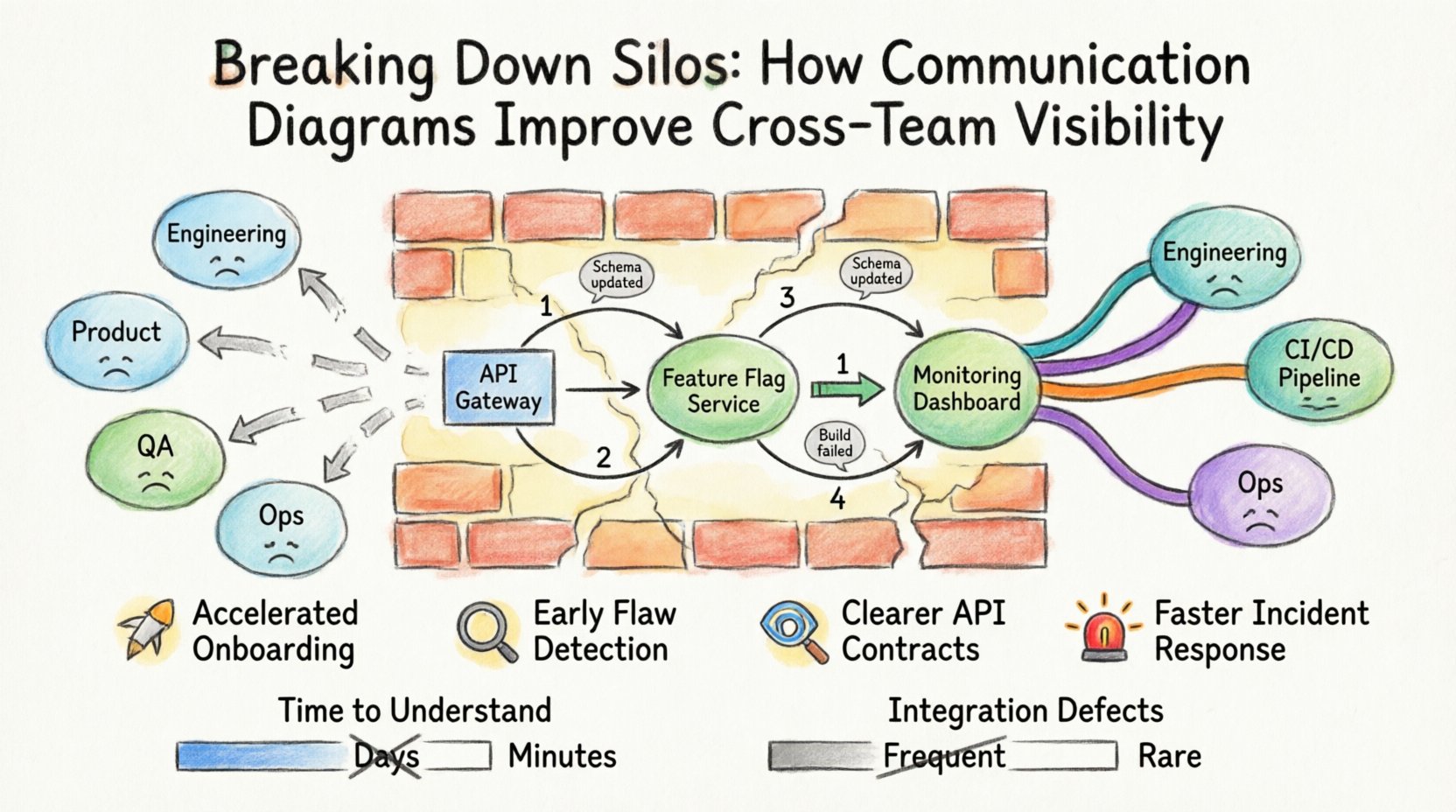
1. Accelerated Onboarding 🚀
New hires often struggle to understand the codebase. A well-maintained set of diagrams provides an immediate map of the system. Instead of reading thousands of lines of code, a new engineer can review the interaction flows to understand how data moves from entry to storage. This reduces the ramp-up time significantly.
2. Early Detection of Design Flaws 🔍
Errors are cheaper to fix in the design phase than in production. During architecture reviews, teams can walk through the diagram together. They might notice a circular dependency or a missing connection that was overlooked in text-based discussions. Catching these issues early prevents costly refactoring later.
3. Clearer API Contracts 📡
Frontend and backend teams often disagree on payload structures. A communication diagram can explicitly label the messages exchanged between the client and the server. This clarity ensures that both sides agree on the data format before implementation begins.
4. Improved Incident Response 🚨
When a system outage occurs, engineers need to know where to look. A diagram of the current architecture helps identify the likely point of failure. Instead of guessing which service is down, the team can trace the message flow to the problematic component.
Steps to Implement Visual Standards 📋
Adopting this practice requires a structured approach. It is not enough to simply draw pictures; the process must be integrated into the daily workflow.
- Define the Scope: Determine which systems require diagrams. Start with high-risk or complex areas. Do not attempt to diagram every microservice immediately.
- Establish Naming Conventions: Ensure object names are consistent. Use domain-driven naming (e.g.,
OrderProcessorinstead ofObj1) so that the diagram reflects business concepts. - Set Granularity Rules: Decide the level of detail. Should the diagram show every method call, or just the high-level interactions? Consistency prevents confusion.
- Integrate with Version Control: Store diagrams alongside the code. This ensures that when code changes, the diagram is updated in the same commit or pull request.
- Schedule Reviews: Make diagram updates a requirement for code acceptance. If the architecture changes, the visual model must reflect that change.
Common Mistakes to Avoid 🚫
Even with good intentions, teams often introduce new problems by overcomplicating their visual documentation. Be mindful of these common pitfalls.
- Over-Engineering: Creating diagrams that are too detailed for the audience. A high-level view is often more useful than a deep dive into internal logic.
- Stale Documentation: A diagram that does not match the current code is worse than no diagram at all. It creates false confidence and leads to errors.
- Lack of Standardization: If every engineer uses a different notation style, the diagrams become a personal language rather than a team tool.
- Ignoring the Context: A diagram should not exist in a vacuum. It needs to explain the business context or the specific scenario being modeled.
Measuring Impact on Workflow 📈
To justify the effort of creating and maintaining diagrams, teams should track specific metrics. This data helps demonstrate the value of the initiative to leadership.
| Metric | Before Implementation | After Implementation | Goal |
|---|---|---|---|
| Time to Understand System | High (Hours/Days) | Low (Minutes/Hours) | Reduce ramp-up time |
| Integration Defects | Frequent | Rare | Reduce post-release bugs |
| Communication Cycles | Many clarifications needed | Fewer clarifications needed | Improve decision speed |
| Documentation Currency | Outdated | Current | Ensure reliability |
Sustaining a Culture of Transparency 🔄
Tools and diagrams are only effective if the culture supports them. A culture of transparency encourages teams to share knowledge openly rather than hiding it. Leaders must model this behavior by using diagrams in meetings and encouraging questions about the architecture.
Encourage Feedback Loops
When a team member notices a discrepancy in a diagram, they should feel empowered to flag it without fear of reprisal. This feedback loop keeps the documentation accurate and the team aligned.
Rotate Ownership
Assigning ownership of specific diagrams to different engineers prevents a single point of failure. If only one person knows the system, they become a bottleneck. Rotating responsibility ensures multiple people understand the architecture.
Comparison of Communication Types 📊
Not all documentation serves the same purpose. Understanding where communication diagrams fit in the broader documentation ecosystem is essential.
| Document Type | Primary Focus | Best Used For |
|---|---|---|
| Communication Diagrams | Object Interactions | Understanding data flow and dependencies |
| Sequence Diagrams | Temporal Order | Understanding exact timing and lifecycles |
| Architecture Diagrams | High-Level Structure | Infrastructure and deployment views |
| API Documentation | Interface Details | Specific endpoint parameters and responses |
Practical Checklist for Diagram Reviews ✅
Before publishing or committing a diagram, use this checklist to ensure quality and utility.
- Are all object names descriptive and consistent?
- Do the message arrows clearly indicate direction?
- Are return messages distinguished from request messages?
- Is the diagram readable at a glance?
- Does it reflect the current state of the code?
- Have non-technical stakeholders reviewed it for clarity?
- Is the diagram stored in a central, accessible repository?
Final Thoughts on Architectural Clarity 🌟
Building complex systems requires more than just writing code. It requires a shared understanding of how those pieces fit together. Communication diagrams serve as the common language that allows diverse teams to work in unison. By reducing ambiguity and fostering transparency, organizations can break down the walls that separate their departments.
The investment in creating these visual assets pays off in reduced rework, faster onboarding, and more resilient systems. As teams continue to grow and systems become more distributed, the need for clear, visual documentation will only increase. Prioritizing these diagrams is not just a technical decision; it is a strategic move toward operational efficiency.
Start small. Pick one complex module. Draw the interactions. Share it with the team. Gather feedback. Iterate. Over time, this practice will become embedded in the culture, leading to a more visible and collaborative engineering environment. The path to better software starts with better visibility.