


Streamlining Structured Analysis with New Native Support
Structured system analysis remains a cornerstone of software engineering and business process modeling. Among the various methodologies available, the Yourdon and DeMarco notation stands out for its focus on visualizing how data moves through a system. Visual Paradigm has introduced a major enhancement to its Desktop platform: dedicated support for Yourdon and DeMarco Data Flow Diagrams (DFD).
This guide explores how this update transforms the modeling experience, allowing analysts to move away from manual formatting and focus on system logic. We will cover key concepts, step-by-step guidelines, and best practices for leveraging this new feature effectively.
Key Concepts
Before diving into the tool, it is essential to understand the specific elements that define the Yourdon and DeMarco methodology, distinguishing it from other notations like Gane & Sarson.
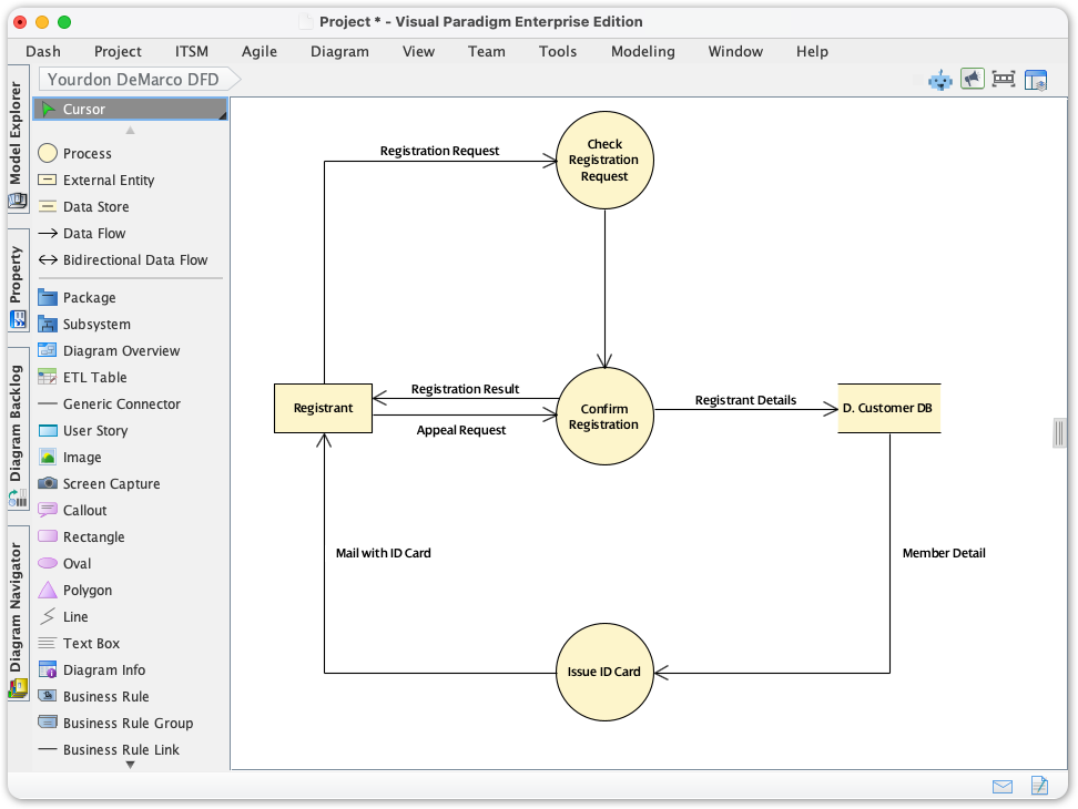
- Processes (Function Bubbles): Represented as circles. These transform incoming data into outgoing data. In Yourdon-DeMarco, the circular shape is iconic and distinct from the rounded rectangles found in other notations.
- Data Flows: Represented by curved or straight arrows. These depict the path data takes between processes, stores, and entities.
- Data Stores: Represented by parallel lines (open-ended rectangles). These indicate where data is held for later retrieval.
- External Entities (Terminators): Represented as rectangles. These are the sources or destinations of data outside the boundaries of the system being modeled.
The Challenge of Non-Standardized Modeling
Prior to this update, practitioners adhering to the Yourdon-DeMarco standard faced significant friction. While Visual Paradigm is inherently flexible, users often had to repurpose generic shapes to mimic the notation.
This led to three primary issues:
- Compliance Difficulty: Users spent excessive time manually verifying symbol syntax rather than analyzing data flow.
- Presentation Inefficiencies: Time was lost on manual alignment and resizing of generic shapes to look like standard DFD elements.
- Model Inconsistency: Large teams struggled to maintain a uniform look and feel, leading to potential misinterpretations of the system architecture.
Guidelines: Creating Your First Yourdon and DeMarco DFD
Visual Paradigm has integrated this notation directly into the diagram creation workflow. Follow these steps to generate standards-compliant diagrams immediately.
Step 1: Initialize the Diagram
Accessing the new feature is straightforward within the Visual Paradigm Desktop interface:
- Navigate to the top toolbar and click on the Diagram menu.
- Select New to open the diagram gallery.
- In the search bar, type Yourdon DeMarco.
- Select the template to launch the specific modeling canvas.
Step 2: utilizing the Drag-and-Drop Palette
Once the canvas is open, you will notice the toolbar is now populated with specific Yourdon-DeMarco elements. You no longer need to hunt for generic circles or lines.
- Drag a Process (circle) onto the canvas to represent a system function.
- Drop External Entities to define the system boundaries.
- Use the connector tools to draw Data Flows immediately between elements without manual reconfiguration.
Examples: Before and After
To understand the impact of this update, consider a scenario involving an Order Processing System.
Scenario: The “Before” State (Generic Tools)
Workflow: An analyst manually selects a circle shape for “Check Inventory.” They must manually adjust the text alignment to ensure it sits in the center. To add a data store, they draw two parallel lines manually or group two line objects. If the diagram is resized, the grouped lines often become misaligned, requiring further cleanup.
Scenario: The “After” State (Dedicated Support)
Workflow: The analyst selects the “Process” tool from the Yourdon-DeMarco palette. They click once to place the “Check Inventory” bubble. The text is automatically centered and wrapped. To add the “Inventory Database” store, they select the Data Store tool. The symbol is pre-formatted as parallel lines. When connecting the two with a Data Flow, the arrow snaps perfectly to the boundary of the circle, maintaining the connection even if the process bubble is moved.
Best Practices for Structured Analysis
With the tooling friction removed, analysts should focus on the rigor of their diagrams. Adhering to these industry standards ensures your DFDs are communicative and accurate.
- Respect the Hierarchy: DFDs are rarely standalone. Start with a Context Diagram (Level 0) representing the entire system as a single process. Decompose this into Level 1 and Level 2 diagrams. Visual Paradigm supports linking these diagrams to maintain traceability.
- Balance Your Data Flow: Ensure “conservation of data.” The data flowing into a process must be sufficient to generate the data flowing out. If a process outputs a “Customer Invoice,” it must have inputs for “Order Details” and “Pricing,” not just “Customer Name.”
- Naming Conventions:
- Processes: Use strong verb-noun phrases (e.g., “Calculate Tax,” “Verify User”).
- Data Flows: Use noun phrases describing the packet of data (e.g., “Verified Credentials,” “Order ID”).
Tips and Tricks for Efficiency
Leverage the advanced features of Visual Paradigm to maximize the utility of the new Yourdon-DeMarco notation support.
1. Use Smart Alignment Tools
Don’t waste time manually lining up bubbles. Select multiple processes and use the alignment tools in the toolbar to distribute them evenly vertically or horizontally. This makes the flow of logic easier for stakeholders to read.
2. Reuse Modeling Components
Visual Paradigm’s strength lies in its repository. If you define an External Entity (e.g., “Payment Gateway”) in one diagram, reuse that same model element in other DFD levels. This ensures that if the entity is renamed later, the change propagates across all diagrams automatically.
3. Snap to Geometry
Enable snapping guides. When you drag a data flow arrow near a Process bubble or Data Store, the tool will highlight the connection point. Releasing the mouse button will snap the line to the element, ensuring that moving the element later does not break the line.
Conclusion
The addition of native Yourdon and DeMarco Data Flow Diagram support allows Visual Paradigm users to return to the core objective of systems analysis: defining robust, logical processes. By eliminating the manual overhead of graphical compliance, teams can produce clearer, more standardized documentation faster than before. Dive into the Diagram > New menu today and experience the difference in your structured analysis workflow.