Communication diagrams serve as a critical bridge between abstract system design and concrete implementation details. They map out how objects interact to achieve a specific function within a software architecture. However, as systems grow in complexity, these diagrams often become tangled webs of lines and labels that obscure rather than clarify. When a diagram becomes too dense, it fails its primary purpose: facilitating understanding among stakeholders. This guide explores practical methods to declutter and streamline communication diagrams, ensuring they remain effective tools for technical communication.
🔍 Understanding the Anatomy of Clutter
Before applying solutions, it is necessary to identify what constitutes clutter. Clutter is not merely the presence of many elements; it is the presence of elements that compete for attention or create ambiguity. In the context of system design, several factors contribute to visual noise:
- Overlapping Links: When message arrows cross each other excessively, the flow of control becomes difficult to trace.
- Excessive Detail: Including every single method call or internal state change can overwhelm the reader who is looking for the high-level interaction pattern.
- Inconsistent Naming: Varying conventions for object names or message labels force the reader to constantly reorient themselves.
- Lack of Hierarchy: Without clear visual grouping, all objects appear to hold equal weight, even if some are peripheral actors.
- Redundant Information: Repeating the same message type across multiple instances without variation adds no value.
Recognizing these patterns allows designers to target specific areas for improvement. The goal is not to remove necessary information, but to organize it in a way that aligns with human cognitive processing capabilities.
🧩 Strategic Abstraction Techniques
Abstraction is the process of hiding complex details to focus on what is essential. In diagramming, this means deciding which interactions are relevant to the current discussion. Applying abstraction reduces the cognitive load required to parse the diagram.
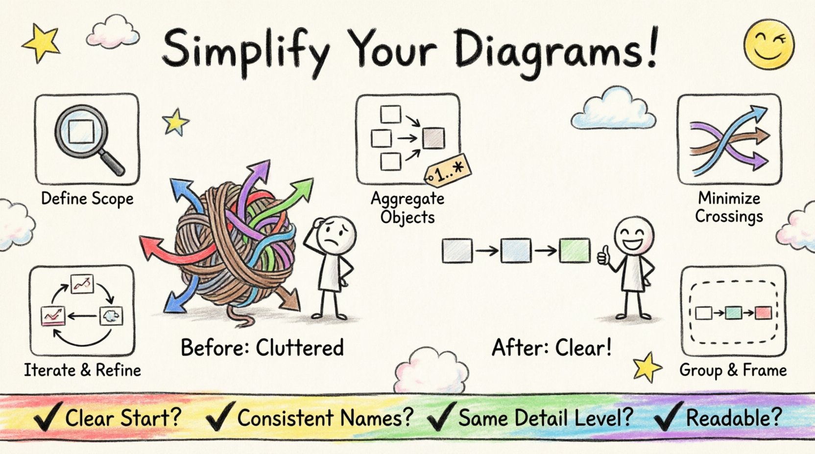
1. Defining Scope and Context
Every diagram should have a defined scope. Are you illustrating a login sequence? A payment processing flow? Or the entire lifecycle of a user session? By narrowing the focus, you eliminate irrelevant objects. For example, if the diagram is about payment validation, external logging services might be omitted unless they directly impact the validation outcome.
2. Aggregating Objects
When multiple objects perform similar roles, consider grouping them under a single representative role or using a composite object. Instead of drawing ten individual customer objects, use a single “Customer” object with a multiplicity indicator (e.g., 1..*). This conveys the concept of multiple actors without cluttering the visual space with duplicates.
3. Hiding Implementation Details
Focus on the interface interactions rather than internal logic. If an object receives a message and processes it internally for a long time, you do not need to diagram every internal step unless it involves another object. Keep the diagram focused on the exchange of information between components.
📐 Visual Hierarchy and Layout Principles
How elements are arranged on the canvas is just as important as which elements are included. A well-structured layout guides the eye naturally from the initiator to the final result.
- Left-to-Right Flow: Most users scan diagrams from left to right. Place the initiator (the source of the first message) on the far left. This creates a natural reading path.
- Minimize Crossing Lines: Crossing arrows create visual confusion. Reorder objects on the horizontal axis to ensure messages flow smoothly without intersecting other lines. If a message must go back to a previous object, route it above or below existing lines rather than through them.
- Vertical Alignment: Align related objects vertically. If Object A communicates with Object B, and later Object A communicates with Object C, position B and C so that the lines from A do not cross unnecessarily.
- Spacing: Leave adequate whitespace between clusters of objects. Whitespace is not empty space; it is a design element that separates distinct concepts.
🔢 Managing Object and Role Multiplicity
Multiplicity indicates how many instances of an object participate in the interaction. Misrepresenting this can lead to diagrams that are either too specific or too vague.
Using Multiplicity Indicators
Instead of drawing multiple instances of the same object type, use a single instance with a multiplicity tag. For example, a “1..*” tag indicates one or more instances. This keeps the diagram clean while accurately representing the system’s capacity.
Handling Iteration and Loops
Loops are common in communication flows. Avoid drawing the same loop multiple times. Instead, use a standard notation to indicate repetition. This might involve a loop frame or a specific label on the message line indicating the number of times it occurs.
Optional and Alternative Paths
Not all paths are equal. Primary flows should be the most prominent. Alternative error paths or optional steps should be visually distinct but not dominant. Use dashed lines or lighter colors to indicate optional interactions, keeping the main solid lines for the core logic.
📦 Leveraging Grouping and Framing
Grouping allows you to encapsulate related interactions. This is particularly useful when a diagram becomes too large to fit on a single view. Frames can denote a specific context, such as a transaction boundary or a specific subsystem.
- Sub-System Boundaries: Draw a box around objects that belong to the same logical subsystem. This visually separates concerns.
- Transaction Blocks: Enclose a sequence of messages that form a single logical transaction within a frame. This helps the reader understand that these steps must succeed or fail together.
- External Interfaces: Group external systems or third-party services together. This distinguishes internal logic from external dependencies.
When using frames, ensure the label is clear. The label should explain the scope of the frame, such as “Payment Processing Context” or “External API Call”.
🔄 Iterative Refinement Processes
Creating a clean diagram is rarely a one-step process. It requires iteration. Start with a rough draft that includes all necessary interactions. Then, review it specifically for clutter.
Step-by-Step Refinement
- Draft: Create the initial diagram with all objects and messages.
- Review: Step away and look at the diagram fresh. Identify areas where lines cross or where labels are dense.
- Simplify: Remove non-essential objects. Aggregate similar objects.
- Re-arrange: Move objects to reduce line crossings.
- Label: Ensure all labels are concise and consistent.
- Validate: Check against the requirements to ensure nothing critical was removed.
📊 Common Clutter Patterns and Solutions
| Clutter Pattern | Impact | Solution |
|---|---|---|
| Crossing Arrows | Confuses message flow direction | Reorder objects horizontally to minimize intersections |
| Duplicate Objects | Wastes space and implies redundancy | Use multiplicity notation (e.g., 1..*) instead |
| Long Message Labels | Requires too much scrolling or zooming | Use short, consistent abbreviations; link to documentation |
| Mixed Granularity | Makes the diagram look inconsistent | Ensure all messages are at the same level of detail |
| Unlabeled Lines | Reader cannot understand the data transfer | Always label messages with action and data |
✅ Checklist for Review
Before finalizing a diagram, run through this checklist to ensure clarity and maintainability.
- Clarity of Initiator: Is the starting object clearly identified?
- Readability: Can the diagram be understood without a legend?
- Consistency: Are object names and message labels consistent throughout?
- Naming Conventions: Do object names follow the project’s standard naming guidelines?
- Completeness: Does the diagram cover the required scenarios (happy path and exceptions)?
- Scalability: If a new object is added, will the diagram remain readable?
- Context: Is the scope of the diagram defined in the title or caption?
🎯 The Value of Simplicity
Simplifying a communication diagram is not about making it less accurate; it is about making it more accurate for the human reader. A diagram that is easy to read is more likely to be consulted during development, testing, and maintenance. It serves as a reliable reference point for the entire team.
By applying these strategies, you transform a complex web of interactions into a clear narrative of system behavior. The effort invested in decluttering pays dividends in reduced miscommunication and fewer implementation errors. Remember that a diagram is a communication tool first and a technical artifact second. Prioritize the reader’s understanding above all else.