Understanding the architecture of a software system can often feel like trying to read a map written in a foreign language. 🗺️ For business leaders, product owners, and project managers, the technical details of code can obscure the bigger picture. However, visual representations exist to bridge this gap. One of the most effective tools for communicating high-level system structure is the package diagram. This guide is designed to help non-technical stakeholders understand what these diagrams represent, why they matter, and how to use them to make better business decisions.
Why Visualizing Structure Matters 🧩
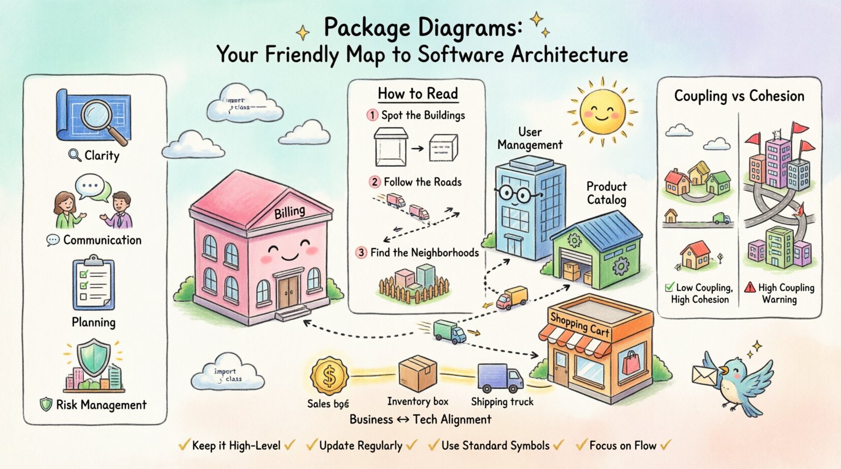
Before diving into the specifics of the diagram itself, it is essential to understand the value of visualization. Software systems are complex collections of logic, data, and interactions. Without a map, navigating changes or understanding risks is difficult.
- Clarity: Diagrams turn abstract code into concrete shapes and lines.
- Communication: They provide a common language for developers and business teams.
- Planning: They help identify dependencies before work begins.
- Risk Management: They highlight areas where changes might cause unintended side effects.
When you look at a package diagram, you are not looking at lines of code. You are looking at the organization of functionality. Think of it like a city map. You do not see every brick in the building; you see the blocks, the roads, and how districts connect.
What is a Package Diagram? 📐
A package diagram is a type of UML (Unified Modeling Language) diagram. It groups related elements together to reduce complexity. In the context of software architecture, these groups are called packages. Each package represents a collection of functionality that belongs together.
Core Concepts
To read this diagram effectively, you need to understand three fundamental building blocks:
- Packages: These are the boxes on the map. They represent modules, subsystems, or logical groupings of features. For example, a “Billing” package contains all logic related to payments.
- Interfaces: These are the doors or gates. They define how one package talks to another without needing to know the internal details.
- Dependencies: These are the arrows. They show direction. If Package A depends on Package B, it means Package A needs something from Package B to function.
How to Read the Diagram 🧐
Reading a package diagram requires a shift in perspective. Instead of looking for logic, look for relationships. Here is a step-by-step approach to interpreting the visual data.
1. Identify the Boundaries
Start by scanning the boxes. What are the main sections? Large systems are often divided into domains. For instance, a system might have a User Management package, a Transaction package, and a Reporting package.
Ask yourself:
- What is the purpose of this specific box?
- Does this box align with a business unit or department?
2. Trace the Arrows
Arrows indicate flow and dependency. An arrow pointing from A to B usually means A calls B. This is critical for understanding impact.
| Direction | Meaning | Business Implication |
|---|---|---|
| A → B | A uses B | If B changes, A might break. |
| A ↔ B | A and B use each other | High coupling; changes are risky for both. |
| → (No connection) | Independent | Changes in one do not affect the other. |
3. Spot the Clusters
Often, packages are clustered together to show they belong to the same logical area. Look for groups that share many internal connections. These clusters often represent core business capabilities.
Key Metrics for Stakeholders 📊
You do not need to know how to code to evaluate the health of a system using a package diagram. There are structural patterns that indicate stability or risk.
Coupling vs. Cohesion
These two concepts are the heartbeat of good software design. Understanding them helps you gauge technical debt.
- Cohesion: How closely related the items inside a single package are. High cohesion is good. It means the package does one thing well.
- Coupling: How many external packages a package relies on. Low coupling is good. It means the package is independent.
High Coupling Warning Signs 🚩
When you see a web of arrows connecting many different packages, it suggests tight coupling. This can lead to:
- Slower development speed (changes require wide coordination).
- Higher risk of bugs (one small change breaks many things).
- Difficulty scaling (you cannot move parts of the system independently).
Low Coupling Benefits ✅
When packages are isolated, the system is more flexible. You can upgrade one part without touching another. This supports agile business requirements where market needs change frequently.
Mapping Business to Technology 🏢
One of the most valuable uses of a package diagram is to map technical components to business capabilities. This alignment ensures that technology supports the organization’s goals.
The Alignment Exercise
When reviewing a diagram with your technical team, ask the following questions:
- Does every business function have a corresponding package? If a new feature is requested, where will it live?
- Are business domains separated? For example, should “Sales” logic be mixed with “Inventory” logic? Usually, they should be distinct packages.
- Are there bottlenecks? Is there one central package that all others depend on? If that package slows down, the whole system slows down.
Example Scenario: E-Commerce System
Imagine a diagram for an online store. You might see these packages:
- Product Catalog: Manages item details and images.
- Shopping Cart: Manages temporary selections.
- Checkout: Handles payment processing and tax.
- Shipping: Calculates delivery rates and tracking.
If you see the Shipping package depending on the Product Catalog, you know that shipping rates rely on product data. If the Checkout package depends on Shipping, it knows that the final cost cannot be calculated without shipping data. This flow is visible on the diagram.
Risk Assessment and Maintenance 🛠️
Software is never static. It evolves. Package diagrams help teams plan for that evolution. They are not just for new builds; they are vital for maintenance.
Identifying Technical Debt
Over time, systems can become messy. A package diagram makes this visible. Look for:
- God Packages: One package that is too large and connected to everything else.
- Circular Dependencies: Package A depends on B, and B depends on A. This creates a loop that is hard to break.
- Orphan Packages: Packages with no incoming or outgoing connections that might be unused or forgotten.
Planning Changes
Before starting a major project, review the diagram. If you plan to change the Checkout system, trace the arrows pointing to it. Who is calling it? This helps you create a comprehensive test plan and informs stakeholders of the scope.
Collaboration Strategies 🤝
Using these diagrams effectively requires collaboration between business and technical teams. Here is how to facilitate productive discussions.
- Keep it High-Level: Do not get bogged down in class names. Focus on the packages and their relationships.
- Update Regularly: A diagram is only useful if it is current. Schedule reviews during sprint planning or quarterly reviews.
- Use Standard Symbols: Ensure everyone understands the arrows and boxes. Avoid custom icons that are not standard.
- Focus on Flow: Discuss how data moves through the packages. This often reveals performance issues.
Common Pitfalls to Avoid ⚠️
Even with the best intentions, diagrams can be misused. Be aware of these common traps.
| Pitfall | Consequence | Mitigation |
|---|---|---|
| Over-Documenting | Diagram becomes too detailed to be useful. | Focus on the 20% of packages that matter most. |
| Outdated Maps | Team follows a map that no longer exists. | Link diagram updates to code release processes. |
| Ignoring Context | Diagram lacks business context. | Label packages with business terms, not just code terms. |
Frequently Asked Questions ❓
Do I need to know code to understand this?
No. The diagram is designed to abstract away code details. It focuses on the organization of features. If you understand how your business works, you understand the diagram.
How often should we update the diagram?
It depends on the pace of change. For fast-moving projects, update it every sprint. For stable systems, a quarterly review is often sufficient.
What if the diagram is too complex?
Complexity is normal for large systems. Use layers. Show a high-level view with major packages, and allow users to drill down into specific areas for more detail. Do not try to show everything on one screen.
Can this help with budgeting?
Yes. Understanding dependencies helps estimate effort. If a change requires modifying five interconnected packages, it will cost more than a change to one isolated package. The diagram provides the evidence for these estimates.
Summary and Next Steps 🚀
Package diagrams are powerful tools for translating technical complexity into business insight. They allow non-technical stakeholders to see the structure of the system, understand risks, and participate in architectural decisions. By focusing on packages, interfaces, and dependencies, you can move beyond the noise of implementation details.
To get started:
- Request a high-level package diagram for your current project.
- Review the dependencies to understand the flow of data.
- Discuss alignment with business goals during planning meetings.
- Encourage the team to keep the visual map up to date.
With this knowledge, you are better equipped to guide your organization through digital transformation. You can ask the right questions, understand the implications of changes, and ensure that technology serves the business effectively. The map is there; now you know how to read it.