System performance is often viewed strictly as a function of code efficiency, hardware capacity, or network bandwidth. However, the root causes of latency and throughput issues frequently originate in the design phase. When architects and developers model how components interact, they are essentially mapping the potential load paths of the system. A well-constructed Communication Diagram does more than document behavior; it exposes architectural friction before a single line of code is executed.
By refining these visual models, teams can identify redundant object interactions, unnecessary serialization steps, and synchronous dependencies that block execution. This guide explores how to leverage communication diagrams to drive tangible performance improvements. We will examine the structural elements that impact runtime behavior, analyze common modeling patterns that introduce overhead, and provide actionable strategies for streamlining system interactions.
Understanding the Link Between Diagrams and Runtime 📊
A communication diagram represents the structural and dynamic aspects of a system by showing objects and the messages they exchange. Unlike sequence diagrams, which emphasize the timeline of events, communication diagrams focus on the structural relationships between objects. This distinction is critical when optimizing for performance.
When a diagram accurately reflects the intended architecture, it allows stakeholders to visualize data flow and control paths without getting bogged down in temporal details. This clarity enables the identification of:
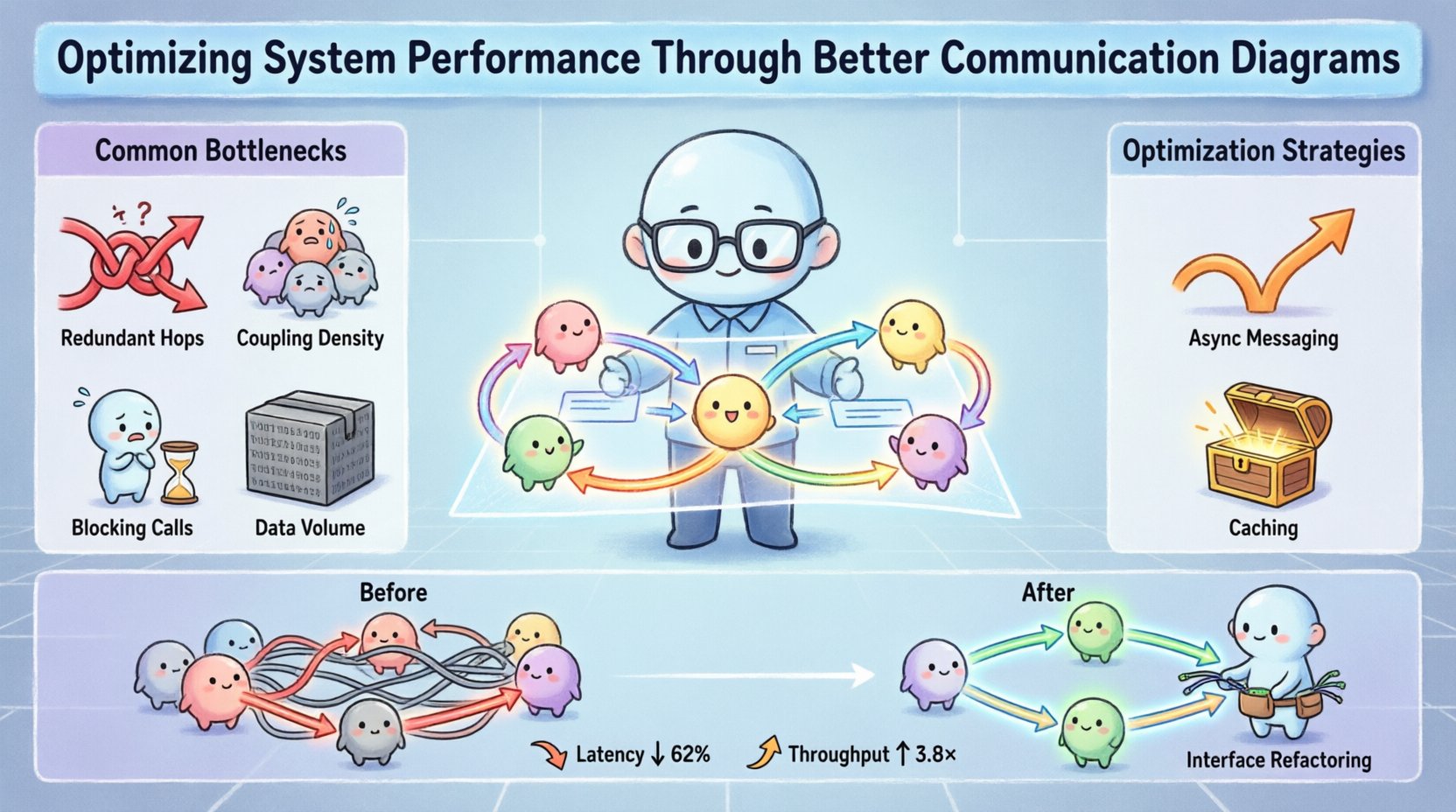
- Redundant Hops: Messages passing through too many intermediary objects before reaching their destination.
- Coupling Density: High levels of interdependence that can cause cascading failures or slow down processing.
- Blocking Calls: Synchronous interactions that force a waiting state on the caller.
- Data Volume: Points where large payloads are exchanged repeatedly between components.
These factors directly correlate to system metrics such as response time, CPU utilization, and memory footprint. If the model shows a linear chain of ten objects for a simple query, the implementation will likely suffer from increased latency. Conversely, a streamlined model suggests a more direct path, reducing the overhead associated with method invocations and context switching.
Key Components of a Performance-Focused Diagram 🛠️
To optimize system performance, the communication diagram must highlight specific architectural patterns that influence efficiency. Every element in the diagram carries weight. Understanding which elements impact performance is the first step toward optimization.
1. Object Identification and Granularity
The level of detail in object representation matters. If objects are too granular, the diagram becomes cluttered, making it difficult to spot high-level bottlenecks. If objects are too abstract, critical interactions are hidden. The goal is a balance where each object represents a distinct service or functional unit.
- High-Level Services: Grouping related functionalities into a single object reduces the number of links in the chain.
- Interface Segregation: Ensuring objects only communicate via necessary interfaces prevents unnecessary data transmission.
- Stateless Design: Diagrams that show stateless interactions often lead to better scalability, as objects can be replicated without session management overhead.
2. Message Direction and Type
The arrows in the diagram indicate the flow of control and data. The nature of these messages dictates the performance profile.
- Synchronous Messages: Represented by solid arrows. These require the caller to wait for a response. Overuse creates bottlenecks.
- Asynchronous Messages: Represented by open arrows. These allow the caller to continue processing immediately. Favoring these improves throughput.
- Return Messages: Often ignored in high-level diagrams, but they consume bandwidth. Minimizing return data is a valid optimization strategy.
3. Link Multiplicity and Navigation
Links represent the ability of one object to reach another. In a diagram, this is often implied by the arrows. In code, this translates to object references.
- Direct Links: A direct link between Object A and Object C is faster than A → B → C.
- Navigation Paths: If the diagram shows a need to traverse multiple objects to find data, the implementation requires multiple database lookups or service calls.
Identifying Bottlenecks Through Visual Analysis 🔍
Once the diagram is drafted, the next phase is analysis. This involves scanning the visual representation for patterns that are known to degrade performance. The following checklist helps teams spot issues early.
- Chained Calls: Look for a single message triggering a cascade of subsequent messages. This is often a sign of deep coupling.
- Circular Dependencies: If Object A calls B, and B calls A, this creates a loop risk and potential deadlock scenarios.
- Centralized Control: If one object acts as a hub for all other communications, it becomes a single point of failure and a performance choke point.
- Heavy Payloads: Note where large data structures are passed between objects. If a user profile is passed to a logger, the overhead is wasted.
- Repetitive Loops: Diagrams showing objects calling each other in a loop often indicate inefficient polling mechanisms.
By highlighting these areas in the diagram, teams can prioritize refactoring efforts. The visual nature of the diagram makes these issues obvious to non-technical stakeholders as well, facilitating faster decision-making.
Optimization Strategies and Techniques ⚙️
Once bottlenecks are identified, specific strategies can be applied to the design to improve performance. These techniques should be reflected directly in the updated communication diagrams.
1. Decoupling via Messaging
Replace direct method calls with asynchronous messaging where appropriate. In the diagram, this changes a solid arrow to an open arrow. This allows the system to handle requests in parallel rather than sequentially.
- Event-Driven Architecture: Introduce events that trigger actions rather than direct calls. This reduces the dependency chain.
- Message Queues: Diagrams can show an intermediate queue object between producers and consumers to buffer load spikes.
2. Caching and Data Locality
Reduce the need for remote calls by introducing caching layers. In the diagram, this appears as a local storage object within the calling component.
- Local Cache: If an object retrieves data it uses frequently, store it locally rather than calling a service for every request.
- Read-Replicas: Separate read operations from write operations. The diagram should show distinct paths for query and update actions.
3. Interface Refactoring
Ensure that objects only expose the methods they need. A bloated interface forces the receiving object to process data it does not use.
- DTOs (Data Transfer Objects): Use lightweight objects for communication to minimize serialization overhead.
- Method Chaining: Where appropriate, combine multiple operations into a single method call to reduce network round-trips.
Comparing Design Approaches 📉
Visualizing the difference between a standard design and an optimized design helps clarify the impact of changes. The table below outlines common scenarios and their performance implications.
| Scenario | Standard Diagram Pattern | Optimized Diagram Pattern | Performance Impact |
|---|---|---|---|
| Database Access | App → Controller → Service → Repository → DB | App → Service → DB (Direct) | Reduces latency by removing intermediate layers. |
| Authentication | Every API call requires Auth Check | Gateway handles Auth, passes token | Reduces CPU usage on backend services. |
| Data Aggregation | Call Service A, then Service B, then Service C | Call Aggregator Service (Parallel) | Reduces total response time significantly. |
| Logging | Log every internal method call | Log only entry/exit points | Reduces I/O overhead and storage usage. |
| Session State | State stored in each object | State stored in centralized cache | Reduces memory duplication and sync issues. |
This comparison highlights that performance optimization is not just about writing faster code; it is about designing a structure that minimizes work. The communication diagram serves as the blueprint for this structural efficiency.
Maintenance and Evolution of Diagrams 🔄
System performance is not a one-time achievement. As requirements change, the architecture evolves. A static diagram becomes a liability if it does not reflect the current state of the system. Maintaining accurate communication diagrams ensures that performance optimization is an ongoing process.
- Version Control for Diagrams: Treat diagrams as code. Track changes to understand how architectural decisions have shifted over time.
- Automated Validation: Use tools to ensure the diagram adheres to defined standards. This prevents manual errors that could introduce performance regressions.
- Regular Audits: Schedule reviews of the diagrams to identify new bottlenecks introduced by recent changes.
- Feedback Loops: Connect diagram updates with monitoring data. If a specific interaction shows high latency in production, update the diagram to reflect the need for optimization.
When diagrams are treated as living documents, they remain valuable assets for performance tuning. They prevent teams from drifting back into inefficient patterns simply because it is easier to ignore the visual model.
Collaboration and Documentation Standards 🤝
Optimizing for performance requires alignment across the entire development team. If developers, architects, and testers interpret the communication diagram differently, the implementation will suffer. Establishing clear standards for diagramming is essential.
- Consistent Notation: Ensure everyone uses the same symbols for synchronous vs asynchronous calls. Ambiguity leads to implementation errors.
- Naming Conventions: Object and message names should be descriptive. “ProcessData” is vague; “ValidateUserInput” is clear.
- Scope Definition: Clearly define what is included in the diagram. Does it cover the entire system or just a specific module?
- Contextual Notes: Add annotations for known performance constraints. For example, “High latency expected due to legacy integration.”
When documentation is standardized, onboarding new team members becomes faster, and code reviews can focus on logic rather than interpretation. This efficiency translates directly to faster development cycles and more reliable systems.
Advanced Techniques for Complex Systems ⚡
For large-scale systems, standard communication diagrams may not capture the full complexity. Advanced modeling techniques can provide deeper insights into performance characteristics.
1. Hierarchical Diagrams
Break down complex systems into layers. A high-level diagram shows the major services, while detailed diagrams focus on specific modules. This prevents cognitive overload and allows teams to zoom in on problem areas without losing the big picture.
2. Concurrency Markers
Indicate where parallel processing occurs. Use specific notations to show that multiple messages are sent simultaneously to different objects. This visual cue helps developers implement threading or async patterns correctly.
3. Resource Constraints
Label links with estimated resource usage. For example, “High Memory” or “Low Bandwidth.” This forces the team to consider the cost of interactions during the design phase.
These advanced techniques move beyond simple modeling. They turn the diagram into a simulation tool where performance trade-offs can be evaluated before implementation begins.
Measuring the Impact of Changes 📏
After implementing changes based on diagram optimization, it is vital to measure the results. This closes the loop and validates the effort.
- Latency Reduction: Compare response times before and after refactoring.
- Throughput Increase: Measure the number of requests the system can handle per second.
- Resource Utilization: Monitor CPU and memory usage to ensure the new architecture is efficient.
- Error Rates: Ensure that simplifying the flow has not introduced instability.
Tracking these metrics ensures that the optimization efforts yield real-world benefits. If performance does not improve, the diagram should be revisited to identify missed bottlenecks or implementation gaps.
Final Thoughts on Design and Performance 💡
The relationship between design and performance is undeniable. A communication diagram is not merely a static drawing; it is a prediction of system behavior. By treating it as a strategic tool for optimization, teams can prevent performance issues before they arise.
Focusing on object granularity, message types, and interaction paths allows for significant gains in efficiency. These gains compound over time, leading to systems that are faster, more reliable, and easier to maintain. The effort invested in refining these diagrams pays dividends throughout the lifecycle of the software.
As you review your next architecture, look beyond the code. Examine the connections. Simplify the paths. Optimize the flow. The results will be evident in every millisecond of response time saved.