In the landscape of software architecture and system design, clarity is not merely an aesthetic preference; it is a functional necessity. Communication diagrams serve as a critical bridge between abstract logic and concrete implementation details. When subjected to rigorous technical reviews, these diagrams must withstand scrutiny regarding flow, integrity, and scalability. Crafting them requires a disciplined approach that balances visual simplicity with semantic depth. This guide explores the methodology behind producing high-fidelity interaction models that facilitate understanding rather than confusion.
Understanding the Core Purpose 🧠
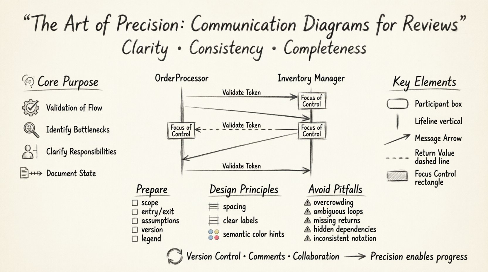
A communication diagram is fundamentally a snapshot of how objects within a system interact over time. Unlike static structural charts, these diagrams emphasize the dynamic exchange of data and control signals. The primary objective during a review is to validate the correctness of these interactions. Reviewers are not looking for artistic flair; they are searching for logical consistency. Does the sender know what to send? Does the receiver know how to handle it? Is the sequence of events logical?
When you create a diagram for a review, you are creating a shared mental model. This model allows disparate stakeholders—developers, architects, and product managers—to discuss complex behaviors without needing to parse thousands of lines of code. The precision of the diagram directly correlates to the efficiency of the review. A vague diagram leads to questions, which lead to delays. A precise diagram leads to confirmation, which leads to progress.
Key considerations for the purpose of the diagram include:
- Validation of Flow: Ensuring that the sequence of messages matches the intended business logic.
- Identification of Bottlenecks: Visualizing where objects wait for responses or block execution.
- Clarification of Responsibilities: Defining which component initiates a request and which processes the outcome.
- Documentation of State: Showing how the state of an object changes through the interaction.
Key Elements of a Standard Diagram 📐
To achieve professional quality, every component within the diagram must serve a distinct function. Clutter is the enemy of precision. Each line, box, and label must be justified by a requirement or a design decision. Below is a breakdown of the essential components that constitute a robust communication model.
| Element | Function | Best Practice |
|---|---|---|
| Participant | Represents an object or class involved in the interaction. | Name classes using domain-specific terminology, not implementation details. |
| Lifeline | Indicates the existence of an object over time. | Keep lifelines vertical and straight; avoid unnecessary angles. |
| Message Arrow | Denotes the direction and type of data transfer. | Distinguish between synchronous and asynchronous calls visually. |
| Return Value | Shows the response from a method call. | Use dashed lines to differentiate from request messages. |
| Focus of Control | Indicates active execution within an object. | Use narrow rectangles on the lifeline to show active periods. |
When labeling participants, avoid generic terms like “Object1” or “Service”. Use names that reflect the business domain, such as “OrderProcessor” or “InventoryManager”. This reduces the cognitive load on the reviewer, allowing them to focus on the logic rather than deciphering identifiers.
Preparing for the Review Process 📋
Before a diagram even enters the review queue, the context surrounding it must be established. A diagram does not exist in a vacuum. It is part of a larger system narrative. Preparation involves defining the scope and the assumptions.
Ensure the following checklist is complete prior to submission:
- Scope Definition: Clearly state which part of the system is being modeled. Is it the entire request lifecycle, or just the payment validation step?
- Entry and Exit Points: Identify where the interaction begins and where it concludes. Does it handle exceptions, or does it assume success?
- Assumptions Documented: If a specific external dependency is assumed to be available, note that assumption. Reviewers should not guess about prerequisites.
- Versioning: Ensure the diagram version matches the codebase version. Outdated diagrams are a significant source of technical debt.
- Legend Availability: If you use non-standard symbols, provide a legend to prevent misinterpretation.
Design Principles for Clarity ✨
Visual hierarchy is as important as logical hierarchy. If a reviewer cannot distinguish between a primary message and a secondary callback, the diagram has failed. Consistency in style contributes to the professional appearance of the documentation.
Spacing and Alignment
Crowded diagrams are difficult to read. Maintain consistent padding between participants. Align lifelines vertically so that the flow moves naturally from left to right or top to bottom. If a message crosses multiple lifelines, ensure the line does not intersect with other messages unless it represents a logical connection.
Labeling Messages
Every arrow should have a label. A blank arrow is ambiguous. The label should describe the action, such as “Request Data” or “Validate Token”. If the message carries specific data payloads, list the key parameters in the label, but keep it concise. Long descriptions should be moved to a separate documentation field.
Color Usage
While avoiding inline styles, if the rendering tool supports semantic coloring, use it sparingly. For example, use red for error paths and green for success paths. This allows reviewers to scan the diagram and immediately understand the failure conditions without reading every label.
Common Pitfalls to Avoid ⚠️
Even experienced architects can fall into traps that reduce the utility of a communication diagram. Being aware of common mistakes allows you to proactively eliminate them. The table below highlights frequent issues and their corresponding solutions.
| Pitfall | Impact | Solution |
|---|---|---|
| Overcrowding | Reviewers miss critical paths due to visual noise. | Break complex interactions into multiple sub-diagrams. |
| Ambiguous Loops | Unclear iteration counts or termination conditions. | Explicitly state the loop condition in the label (e.g., “While Active”). |
| Missing Return Paths | Callers may not know if they received a response. | Always include return arrows for synchronous calls. |
| Hidden Dependencies | Reviewers miss external service requirements. | Represent external services as distinct participants with clear boundaries. |
| Inconsistent Notation | Misunderstanding of message types (sync vs async). | Adhere to a single notation standard throughout the project. |
One of the most common errors is the omission of error handling. A diagram that only shows the “happy path” is incomplete. It gives a false sense of security to the implementation team. You must include branches where validation fails, timeouts occur, or services are unavailable. This ensures the review process identifies potential points of failure early in the design phase.
Handling Complexity in Interactions 🌐
Systems are rarely linear. They involve loops, conditions, and branching paths. Representing this complexity without creating a tangled web requires strategic abstraction.
Fragmentation
When an interaction involves multiple steps that are logically distinct, consider splitting them. For instance, if a user login involves authentication, session creation, and profile loading, these might be better represented as three separate diagrams. This keeps each diagram focused on a specific responsibility.
Conditionals
Use notation to indicate conditions on messages. If a message is only sent under specific circumstances, label the arrow with the condition (e.g., “If Balance > 0”). Do not rely on reviewers to infer logic that is not explicitly stated. This prevents ambiguity during the review.
Asynchronous Operations
In modern architectures, many calls are asynchronous. Use distinct arrowheads or line styles to differentiate these from synchronous blocking calls. Reviewers need to understand where the system waits for a response and where it continues execution. Confusing these can lead to race conditions in the code.
Feedback Integration Strategies 🔄
The review process is iterative. Diagrams evolve based on feedback. How you manage this evolution is just as important as the diagram itself. When feedback is received, it should be treated as a design refinement, not a correction of failure.
Version Control
Maintain a history of changes. If a reviewer suggests moving a message from one participant to another, document the reason. This creates an audit trail that explains why the design changed. It helps future reviewers understand the evolution of the architecture.
Commenting
If a diagram is complex, use comments to explain the reasoning behind a specific design choice. For example, “This loop ensures data consistency before committing.” This context helps reviewers understand the trade-offs made.
Collaboration
Engage with the reviewers during the design phase, not just at the end. Show them a draft to gauge understanding. If they struggle to interpret the diagram, simplify it before the formal review. This proactive approach reduces the number of revision cycles.
Conclusion on Precision and Impact
Communication diagrams are more than just pictures; they are the blueprints of system behavior. When crafted with precision, they become a powerful tool for alignment and quality assurance. They reduce the risk of miscommunication, clarify expectations, and serve as a lasting record of architectural decisions. The effort invested in creating these diagrams pays dividends during the review process and throughout the lifecycle of the software.
By adhering to the principles of clarity, consistency, and completeness, you ensure that your diagrams stand up to scrutiny. They become a source of confidence rather than confusion. In the end, the goal is not to produce a diagram that looks impressive, but one that functions effectively as a communication vehicle. Focus on the logic, respect the reader, and the quality of your design will follow naturally.